|
// technique pulled from:
// https://www.simeongriggs.dev/responsive-extendable-squircles-with-svg-and-css
customElements.define("sq-button", class extends HTMLElement {
constructor() {
super()
this.attachShadow({ mode: "open" })
}
connectedCallback() {
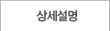
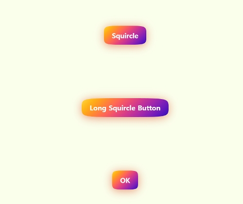
const styles = `
:host {
--drop-shadow: 0 4px 15px rgb(220, 80, 40, 0.6);
--animation-duration: 0.2s;
--bg-gradient: #fc3 5%, #41b 95%;
display: inline-block;
filter: drop-shadow(var(--drop-shadow));
transition: all var(--animation-duration) ease-in-out;
}
/* This effect is cool, but unfortunately has graphical glitches in Safari */
/* :host(:hover) {
scale: 105%;
rotate: -1deg;
} */
svg {
position: absolute;
height: 0px;
width: 0px;
margin-left: -999px;
}
button {
--bg-rotate: 135deg;
-webkit-tap-highlight-color: rgba(0, 0, 0, 0);
appearance: none;
font-size: 1.5rem;
font-family: system-ui;
font-weight: bold;
border: 0;
margin: 0;
padding: .85em 1.15em;
line-height: 1;
color: white;
clip-path: url(#squircleClip);
background-image: linear-gradient(var(--bg-rotate) in oklch, var(--bg-gradient));
transition: --bg-rotate var(--animation-duration) ease-in-out;
}
button:hover {
--bg-rotate: 315deg;
}
`
this.shadowRoot.innerHTML = `
<style>${styles}</style>
<button><slot></slot></button>
<svg>
<clipPath id="squircleClip" clipPathUnits="objectBoundingBox">
<path d="M 0,0.5
C 0,0 0,0 0.5,0
1,0 1,0 1,0.5
1,1 1,1 0.5,1
0,1 0,1 0,0.5"
/>
</clipPath>
</svg>
`
// more rounded d: M 0 0.5 C 0 0.1 0 0 0.5 0 S 1 0.1 1 0.5 S 1 1 0.5 1 S 0 0.9 0 0.5
}
})
|


